Painting Food
There is nothing better than going out to eat on a Friday night after a long week of work. No dishes to do on a Saturday morning and simply letting someone else do all the hard work whilst you catch up with family and friends. You may enjoy going back to your favourite restaurant or maybe you’re the adventurous type and often tries something new.
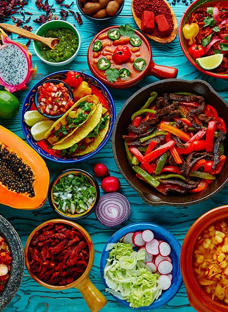
But what makes us try these new places? Is it the recommendations? The offers they have? Or maybe because it just looks cool. Although I personally have my favourite restaurant I like to go to, there is nothing better than experiencing a new place to eat. This starts right at the entrance. It’s got to have that ‘feel’ about it. The eatery has to speak for what it’s selling! You may think an Italian restaurant should be themed in green and red or a Mexican establishment would surely be brightly coloured based on a festival atmosphere. My question for you is how does a restaurant stand out if everyone’s doing the same?
Think differently about the colours your style of food is associated with. What are the tones that come through the food, what complements them? People enjoy freshly well-prepared food. What are the raw states of those colours? Could it be a deep luxurious blue of a mussel’s shell or the bright fresh raw state of a basil leaf? These are the colours that make a dish go WOW!
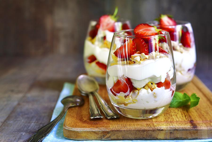
Think about the classic British sherry trifle. What makes it so appealing? It’s the layers! Those luscious juicy strawberries in amongst the bright whites and yellows of the custards and creams. This is a colour palette right there! You have the base whites and what better way to complement it than with a splash of bright red. Not forgetting that it tastes fantastic too!
Why not treat your walls the same? Start with your base colours of a light wispy double cream or a mellow dusky mushroom and splash it with vibrant blood oranges, rich cherries or intense golden caramels.
Every part of the restaurant is a different painting; from the dish itself to the walls and the menus; they should all work with one another. There is no reason why you can’t mix it up with a few different colours that people haven’t thought about before. Just think about the dishes you serve a bit more deeply. Get your customers senses going the moment they open the doors. This could be the start of a new dining experience!